Artists are always looking for new ways to improve their compositions, so we’ve put together a list of 6 popular techniques with examples. Why not try some of these out for your next design?
Go full-on Wes Anderson: Symmetry
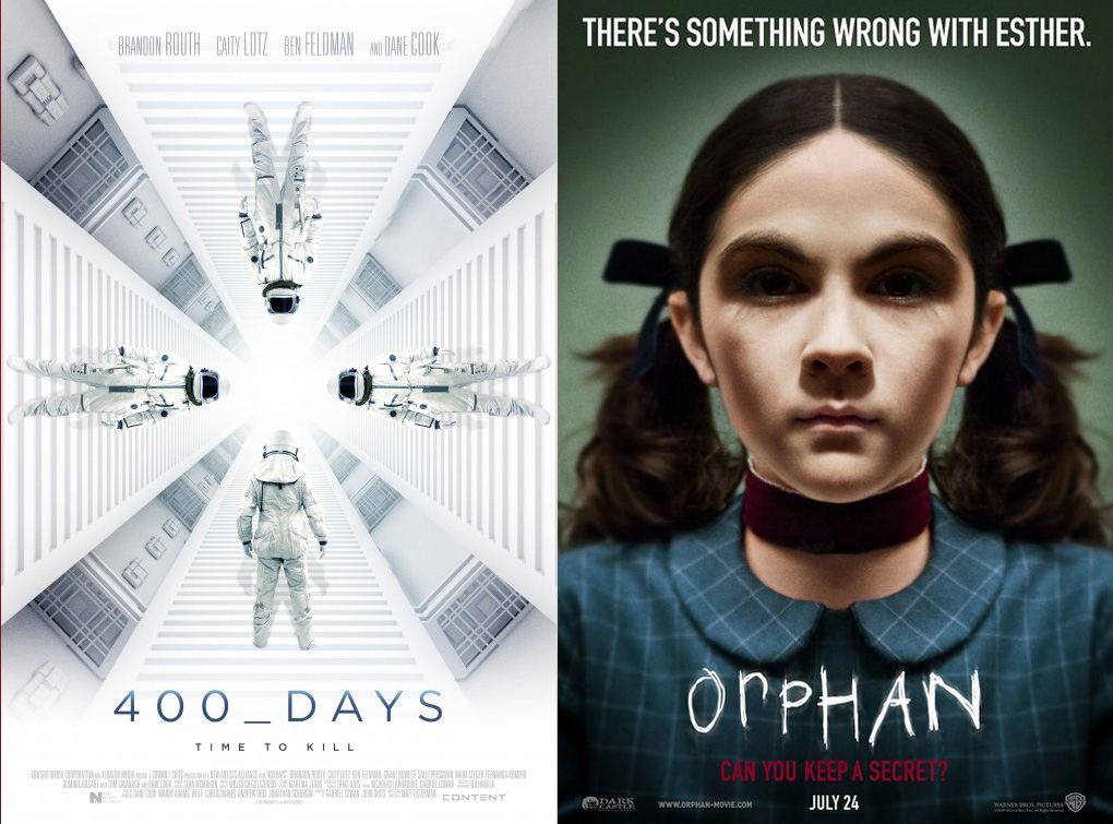
Whatever composition you pick, you want it to be balanced, and the shortest road to balance is through symmetry. There is an elegant simplicity to a design that’s perfectly mirrored; it’s simple and eye-catching in a way that’s either hypnotizing (400 Days) or uncanny (The Orphan). But beware: what you win in neatness you sacrifice in sense of movement.
Listen to the Greeks: The Golden Ratio
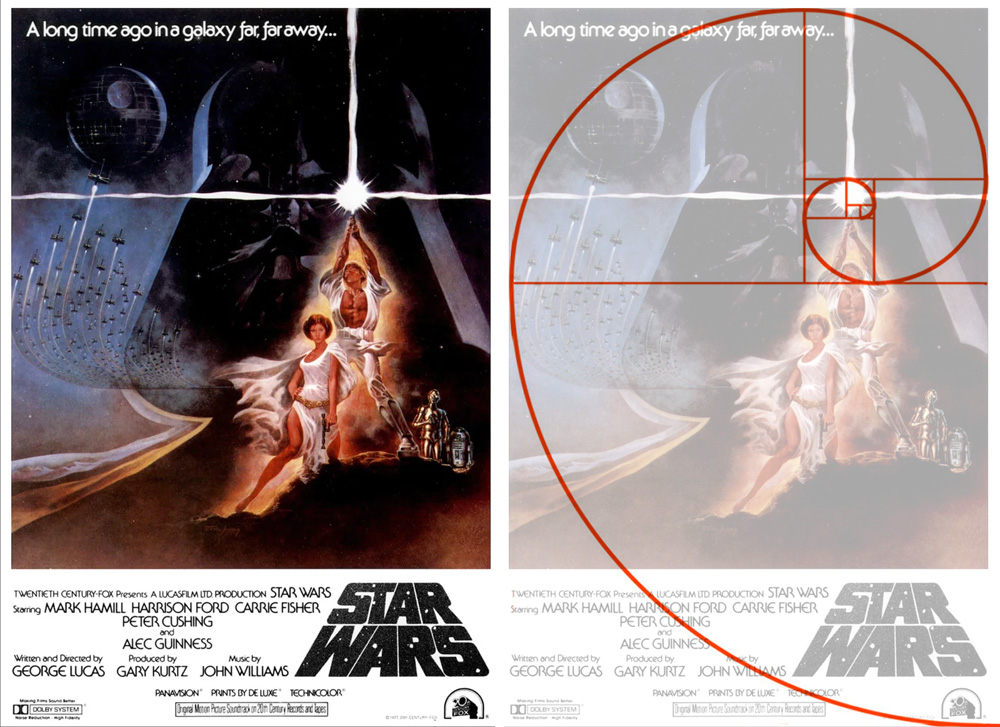
The Golden Ratio is another famous design principle, dating back centuries and found in many classical works of art. It’s similar to the rule of thirds in that the canvas is divided into a grid. However, instead of nine equal rectangles, the grid is a sequence of squares with a ratio of 1 to 1.618. This forms a Golden Spiral, or the Fibonacci Spiral. It’s reminiscent of a shell and, in fact, often pops up in nature, from storm clouds and galaxies to pinecones and yes, shells. The spiral guides the viewer’s eye around the frame, with the focal point ending up slightly off-center.
Rinse and repeat: Patterns
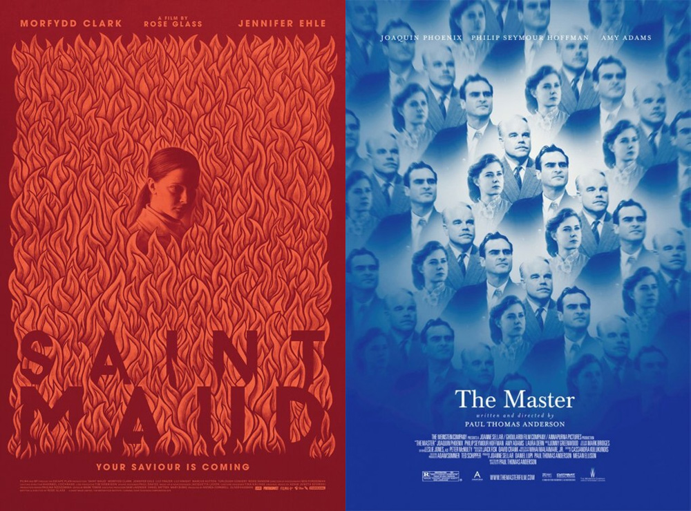
Not only do we humans love a good pattern — we are hardwired to see them even when there aren’t any, in order to make sense of the chaos of nature. Patterns are a popular and versatile choice in most areas of design: textiles, interiors, book covers, stationary… Everything, it seems, but the movie poster. Maybe the pattern is too abstract to be a marketing tool? At any rate, the rare one-sheet that does utilize a pattern really stands out from the crowd.
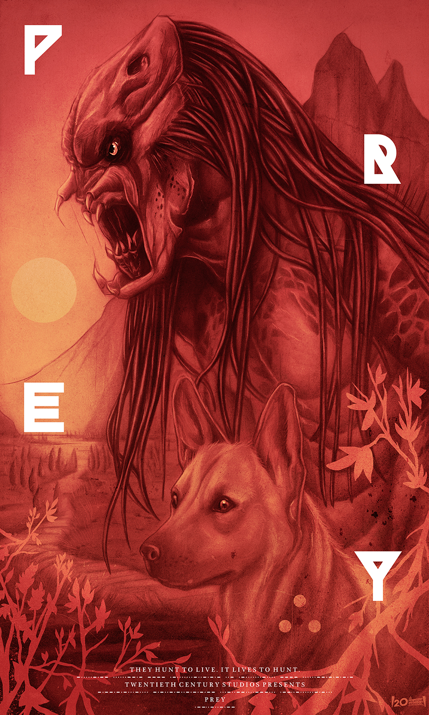
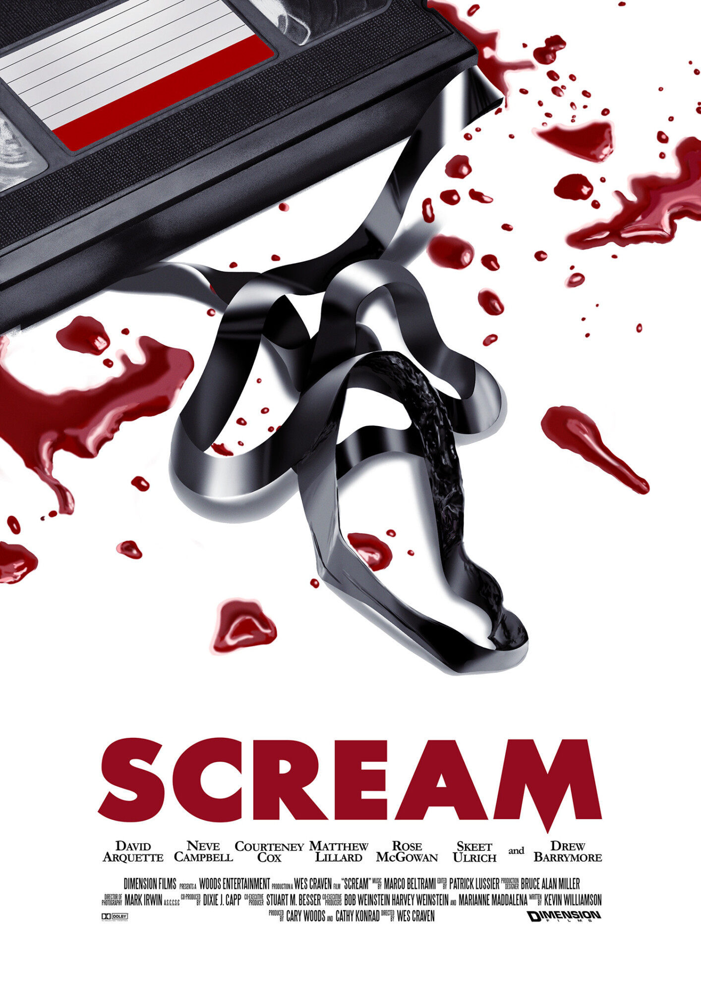
Don’t be too positive: Negative Space
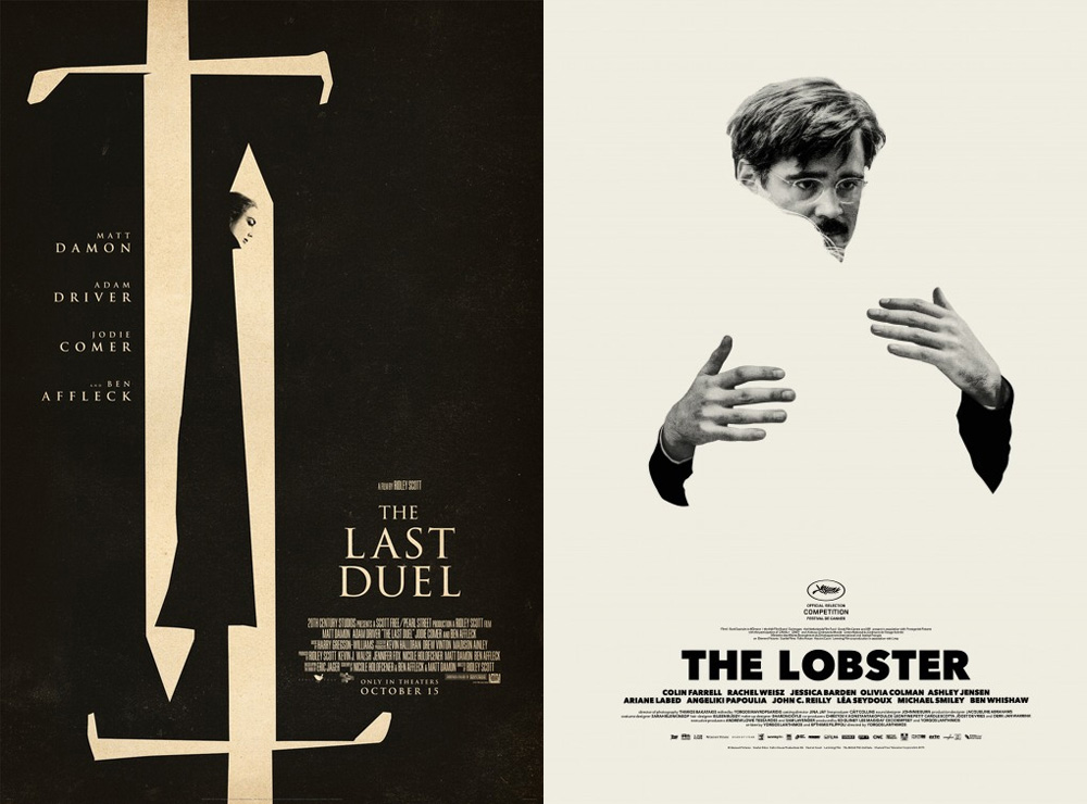
In simplest terms, negative space (or white space, as it’s also called) is the empty area of the layout. This is your poster’s breathing room, defining the limits of objects contained within and the relationships between them. However, the most effective examples of negative space can also double as a clever visual metaphors, such as the silhouette hidden in swords in The Last Duel or the invisible personification of “incompleteness” at the heart of The Lobster.
Do it for the exposure: Double Exposure
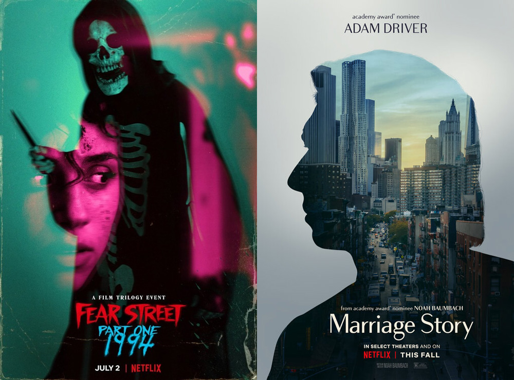
In the 19th century, photographers discovered they could double expose a shot to create an ethereal, otherworldly image. Today most people imitate this effect digitally, but to similarly appealing results. Not only does this composition essentially let you showcase two pictures for the price of one — it can also show relationships between two people, or a person and their surroundings, that would be difficult to convey otherwise. And, of course, it looks cool as all hell.
Look for new angles: Diagonals
We started with the most staid of all compositions and, to bring things full circle, we will end with the most dynamic. Triangles and diagonals help to create movement on your canvas, even when all the objects and subjects are still. Soviet poster designers such as Alexander Rodchenko and the Steinberg brothers were especially proficient in their use of diagonals, and you can use their bold play of line and shape for inspiration.