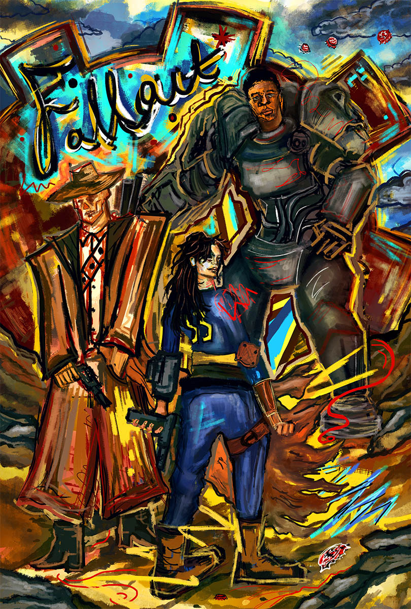
Welcome back to the PRO Spotlight series, where we interview the PRO members of our community. Today we’re talking to Jean-Baptiste Roux, a graphic designer and illustrator from Paris, France, whose background in publishing and screenprinting has resulted in a wonderfully varied body of work.
Hi! Could you please introduce yourself?
My name is Jean-Baptiste Roux, I am 43 years old. I obtained a diploma in advertising design in 1999 and have been a graphic designer and illustrator since. Early on in my career, I had the opportunity to collaborate with Gérard Paris-Clavel of the Grapus collective, and his practice of graphic design still guides me today.
In 2012, I started a blog to share my personal work. This got me noticed by Thomas Olivri of Geek-art.net, who invited me to participate in the Made in Asia exhibition in Brussels. Everything took off from there! I’ve done multiple projects with Geek-art.net, Galerie Sakura in Paris, and Printed in Blood (who have published artbooks for Aliens, Halloween, and Ultraman).
Other notable projects include the official Goldorak Xperienz exhibition, and the official international exhibition for the 50th anniversary of Star Trek (50 years/50 artists) — a dream come true for me!
How did you get into the art of posters?
I wanted to combine two passions, drawing and cinema, as well as lend my own vision to films and video games… This made me take an interest in the illustrations and posters of certain artists and graphic designers. I became a regular on specialized sites: geek-art.net, Alternativemovieposters.com, and, of course, PosterSpy!
How long have you been with PosterSpy? What has your experience been like?
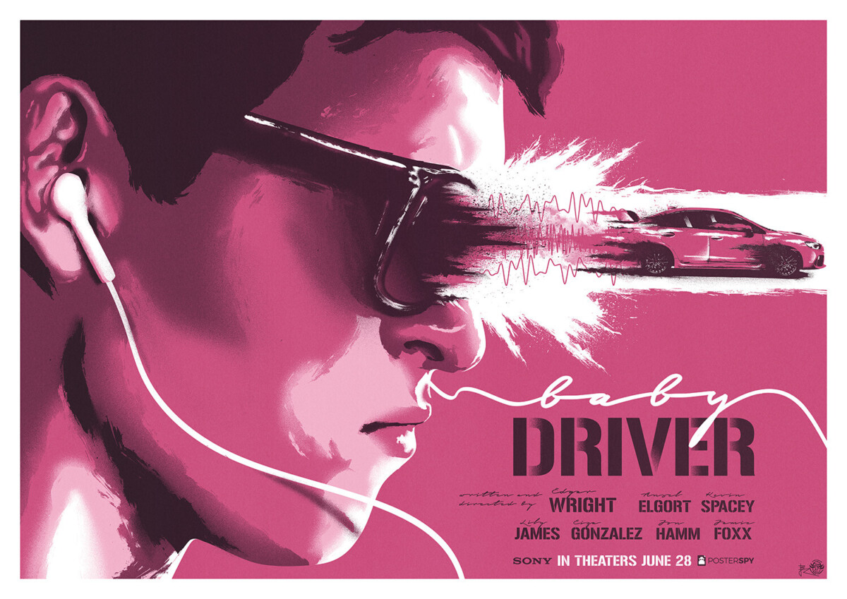
I joined PosterSpy in 2017 and have had an excellent time there since. I love this sense of community on the platform and outside on social media. Moreover, I have participated in several PosterSpy projects: Baby Driver, How to Train Your Dragon, Scooby… A great way for me to push my limits! I want to take this opportunity to thank Jack Woodhams [Founder of PosterSpy] who does an extraordinary job promoting the work of thousands of artists.
What are the influences behind your illustration style?
In terms of form: Grapus (a collective of French graphic designers), abstract art, Soviet propaganda posters, the work of Saul Bass and more recently Olly Moss… As for the subjects, I am a pure product of the 80s and 90s and the films and video games of that era.
Could you walk us through your typical artistic process?
I have two different processes, one for painterly posters and one for more abstract vector work.
With film posters, I start with small sketches, to search for the idea and overall look. The base of my poster is always done in Illustrator. I pay particular attention to the composition of my posters, then I paint over the vector file and add textures in Photoshop.
With geometric vector illustration, I start by making a sketch in a grid notebook, which I then reproduce in Illustrator. I seek to simplify the subject using geometry and symmetry. I often limit myself to a set number of colors. At the end of the project I tend to remove extraneous, parasitic elements from my poster. This moment is as important as the moment of creation. By removing elements, we sometimes manage to simplify the message, to make it more effective, more direct…
Your poster for Maverick is unlike most of your other work. Is there a story behind it?
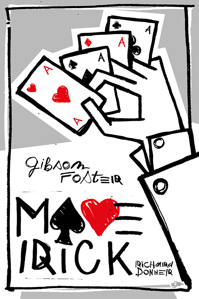
It touches me that you noticed it because indeed there is. Maverick is a film that I love, that I watched dozens of times as a teenager. I made the poster during a special period for me, in 2022. I had just undergone elbow nerve surgery because I was losing the use of my left hand (I’m left-handed)… A little advice to my colleagues: DO NOT REST YOUR ELBOW ON THE DESK WHEN YOU DRAW!
So drawing realistically had become impossible for me. One day, I took some sheets of paper, brushes, and felt-tip pens and drew symbols, an alphabet, hands, eyes, etc. I scanned and vectorized all of this to create an image bank for myself so that I could continue to create during this period of my life. And the Maverick poster is made from that image bank.
We love your remade Kong: Skull Island piece. Was there a particular reason why you chose that poster for a makeover?
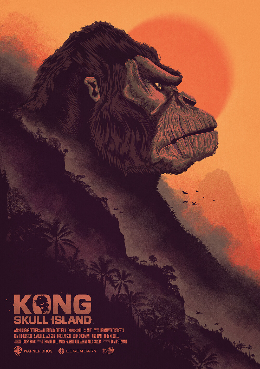
At that time, I was working almost exclusively in Illustrator: vector art, geometric, abstract. Over time, I allowed myself to explore other techniques. I started doing more and more digital painting and I loved it… Every time I looked at the KONG poster, I was happy with the composition but I thought it would be so much stronger if it was painted, so…
What are the favorite posters you’ve done?
It’s hard to choose. Often my favorite poster is the last one — I have a hard time looking back. But my three favorite posters are Hercules, my 300 series (a [project that went fast, everything was fluid from start to finish) and Falling Down. Falling Down is simple, effective and sums up the idea of the film well… The fall of a man. The implosion. It was quite appreciated by the people who follow me apparently.
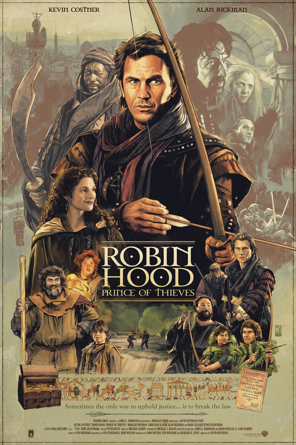
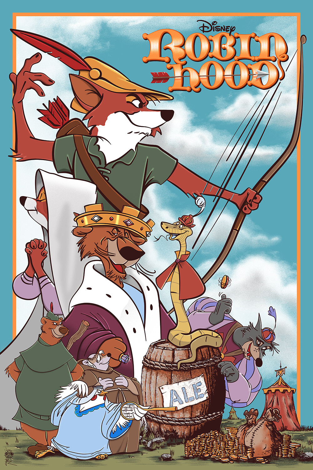
And my favorite commissioned poster is the most recent Robin Hood.
Finally, do you have any fun stories about making art?
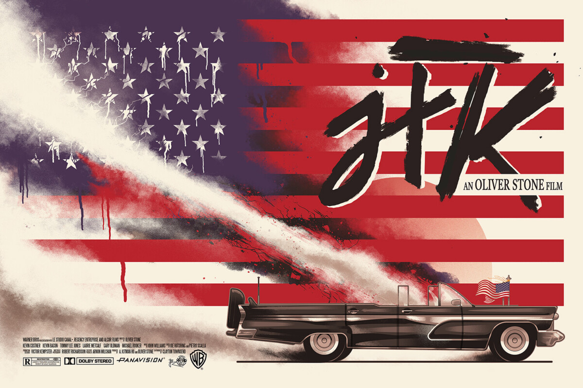
The JFK movie poster is a personal work. As often, it began with the love I have for a film. So I started thinking about a poster. A huge American flag in the background, the president’s car and then nothing… Impossible to finish, to get over the block… A year and a half later — a click! I knew how to finish this project and did so in one day! I love this aspect of creative work, some projects are obvious and others require letting our brain take time…
Follow Jean-Baptiste Roux
