Screen printing is a stencil-based printing technique where ink is pushed onto a surface through a screen (hence the name) that blocks certain areas of the surface but not others. Each colour in a screenprint requires a different screen, and you end up with bold, hard-edged areas of flat, unmodulated colour.
Digital screen printing is an emulation of this technique. While it’s decidedly NOT a substitute for the Real Thing, it’s a fun way to work with colour and shapes because you end up with a minimalist design and a cohesive colour scheme.
Before we start, here are some ground rules:
1. Your piece will use three layers:
- layer 0, aka base layer (“paper”), which can be any light colour.
- layer 1, with Color #1 on it, set to “multiply”;
- layer 2, with Color #2 on it, also set to “multiply”.
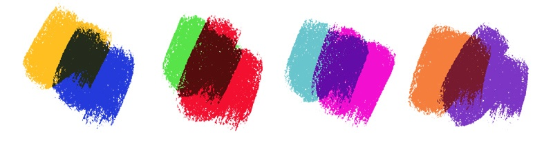
2. You’ll be working with two colours. You can work with three or more (in real life every additional colour adds to the cost of the print, but here feel free to go wild) but for ease of explanation, I’ll be showcasing a combo of two. Because you also have the base colour, plus the combination colour from where colours #1 and #2 overlap, your piece will look like it has four colours (base colour, colour #1, colour #2, colour 1+2).
3. Regarding colour choices: the two colours should be different enough for this to work, but otherwise feel free to experiment with the combinations. Here are some suggestions:
And now, let’s get to drawing!
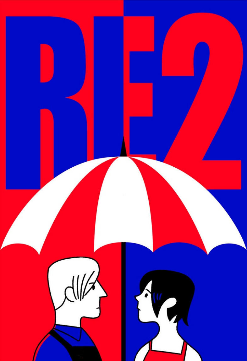
Step 1: initial sketch.
My suggestion is to start with something simple, just to get the hang of things. I personally tend to reverse engineer the entire process — i.e. I start with a three-colour sketch (where one of the colours is roughly the sum of the other two) and then work off it. Here’s my initial sketch — crisp, clean and devoid of personality:
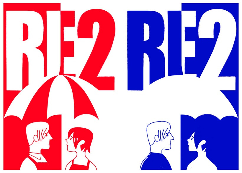
Step 2: layer separation.
I selected all the reds and the blacks and copied them into one layer. Then I selected the blues and the blacks and copied them into a different layer. With the help of a clipping mask, I painted these two layers fully red and fully blue, respectively. The white background was my third layer.
(NB: When you select and copy like that, you lose the crisp outlines — but for this digital screenprint, that actually worked to my advantage).
Step 3: texturing the layers.
First, I made some of the edges deliberately more jagged. I subtracted colour in some places and added colour in others (always minor things). This would give the impression of the paper moving around a little during the screenprinting process.
Then I selected the contents of the red layer, created a new layer on top of it, filled it red with a textured brush, and deleted the initial red layer. The process was then repeated for the blue layer.
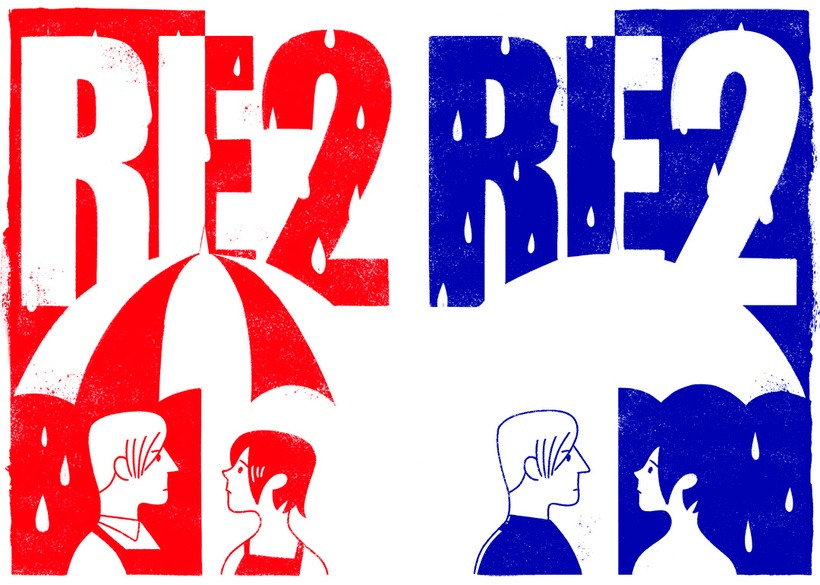
Here’s how the image looks with those two layers set to multiply:
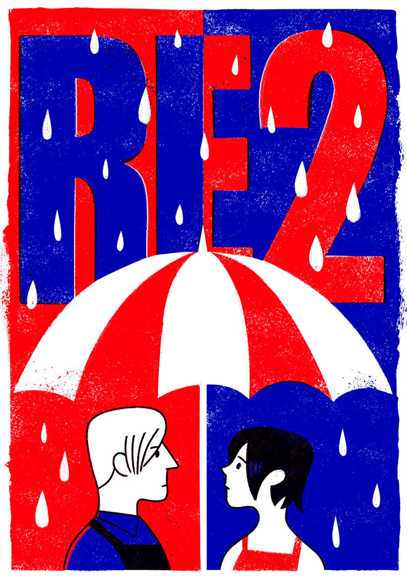
This already looks more fun than the drawing I started out with, even though it’s basically the same picture. Time for the final step!
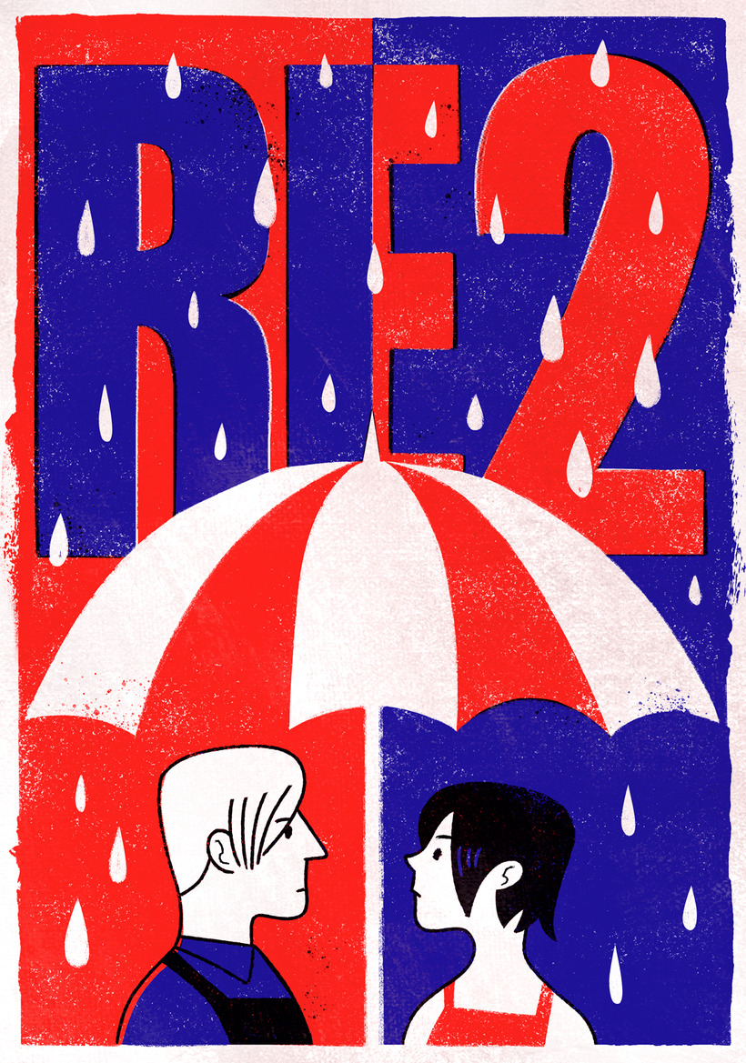
Step 4: more texturing and colour correction.
I merged all the layers and added a scanned paper texture of mine on top of them. I also made the colours less saturated because the shade of blue was really bothering me.
And voilà! A distressed midcentury-style poster that looks like it’s seen better times.
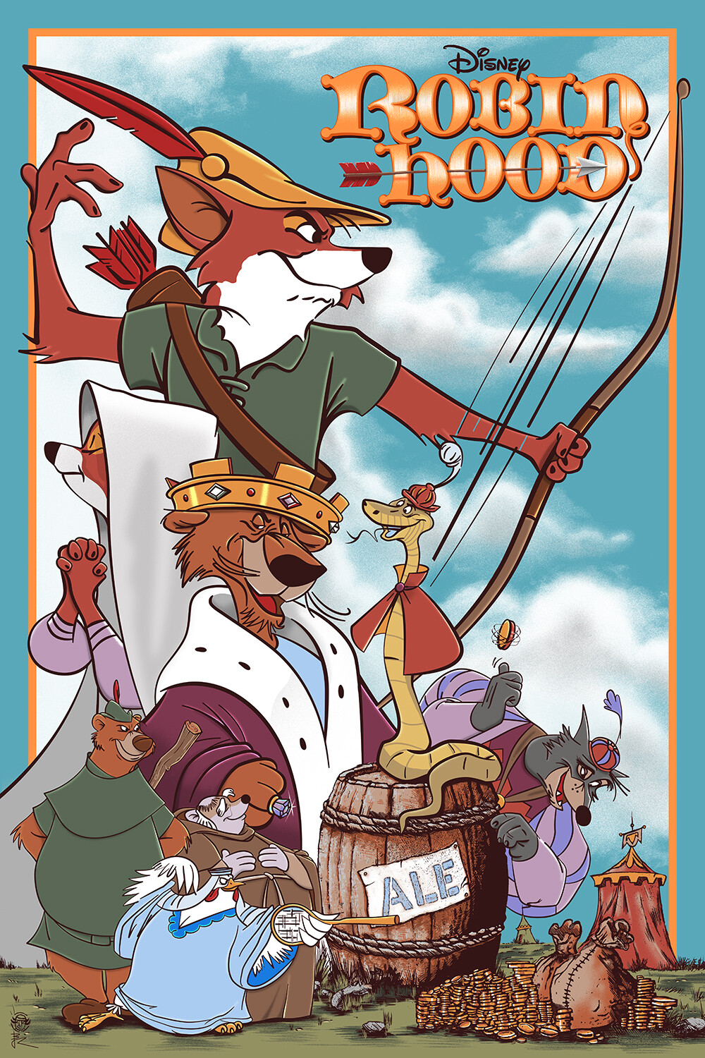
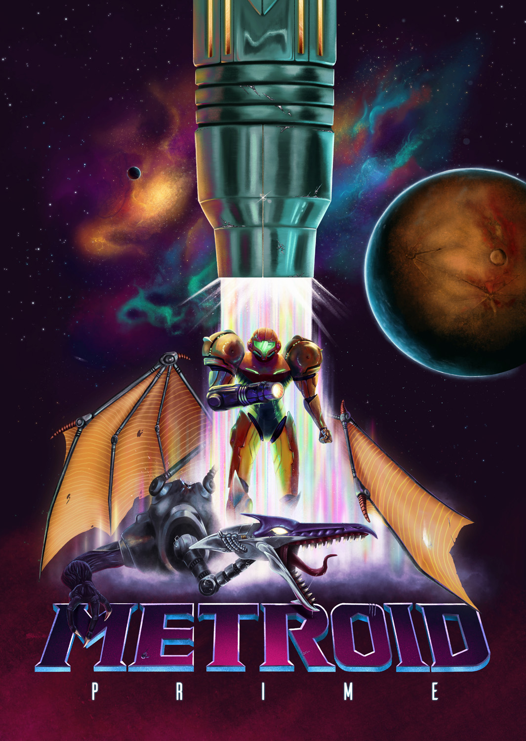
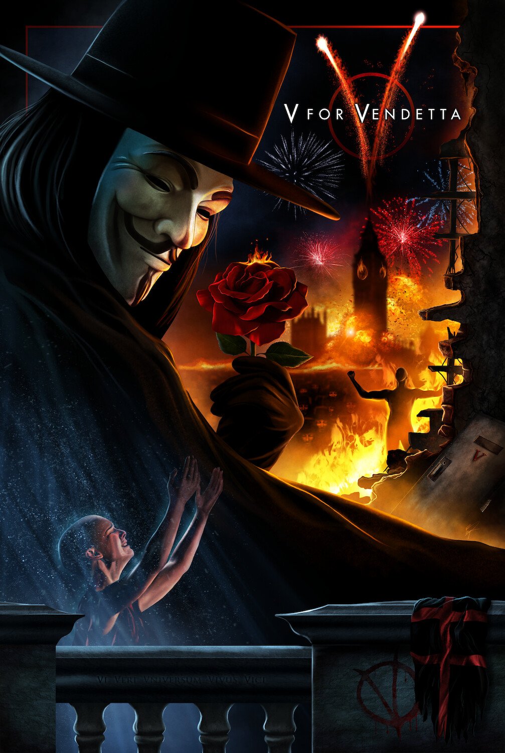
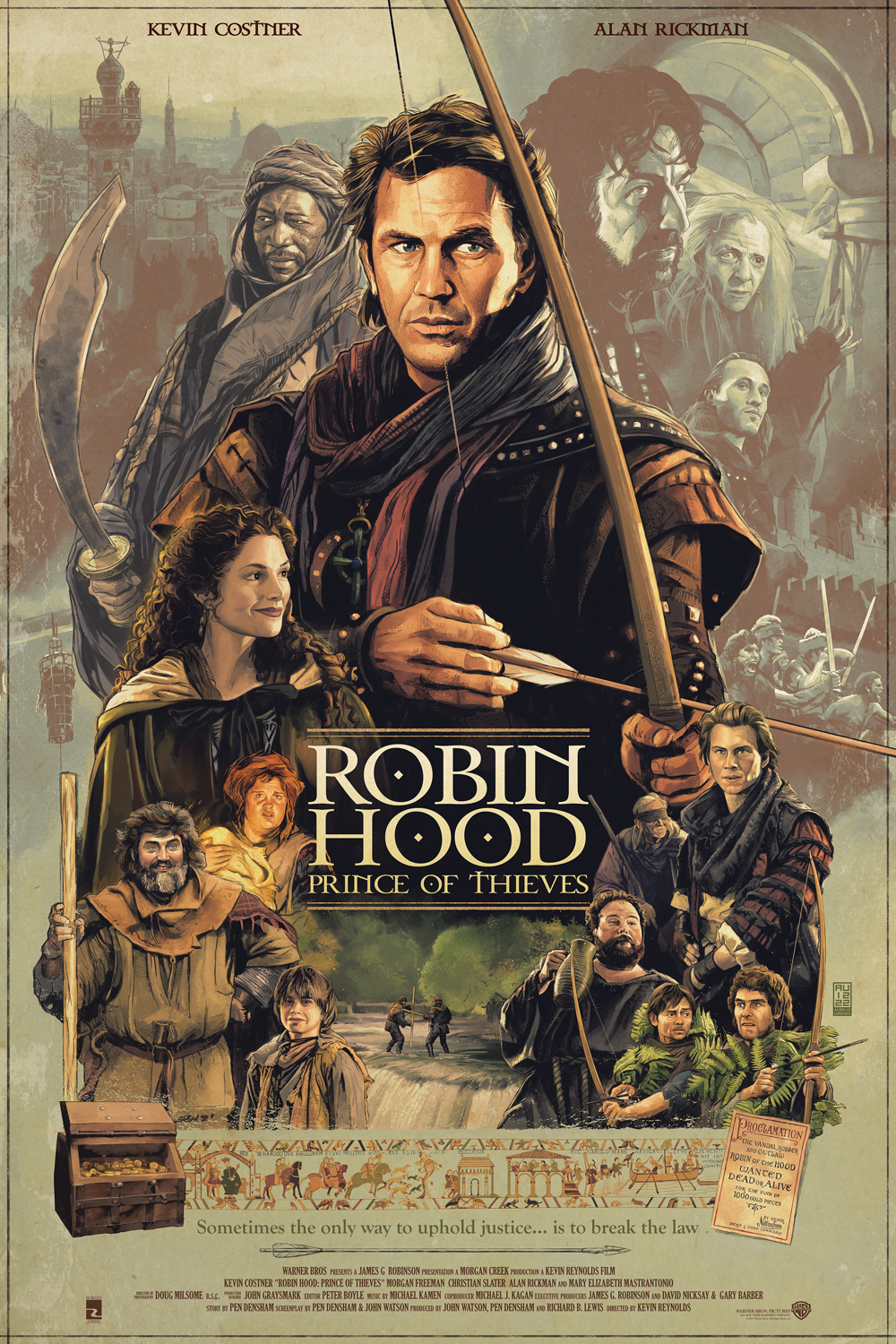
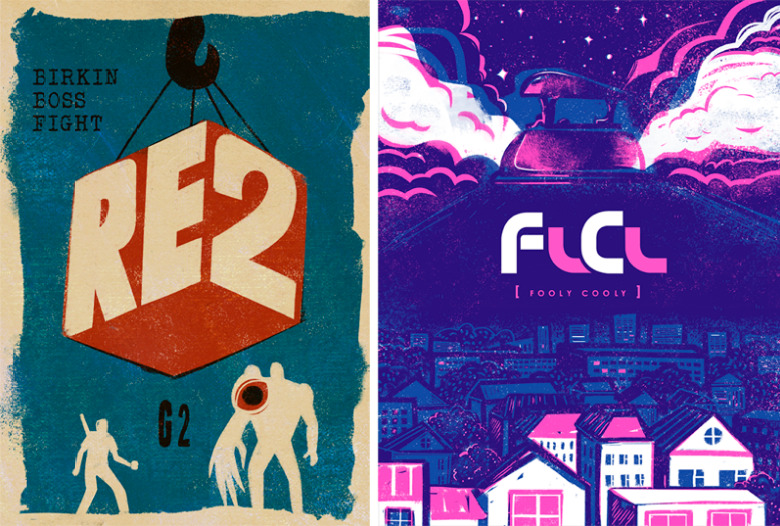
Here are a couple more examples from my poster collection:
Hopefully, you have found this tutorial useful. Happy creating!