If you print it, does it not bleed?
Designers and illustrators working in the digital space are often at a loss the first time they have to prepare their files for print. What does the K in CMYK stand for? What is a slug? And does it ever bleed?
Here at PosterSpy we’ve prepared a short guide to the three cornerstones of the pre-flight process: colour, resolution and dimensions.
Colour
Print-on-demand services (RedBubble, INPRNT, etc.) are okay with RGB files and in fact often prefer them. Most professional printers, however, work with the CMYK colour model. CMYK refers to Cyan, Magenta, Yellow and Key Colour (aka black), which are the four ink plates commonly used in printing.
Many apps (Adobe Photoshop included) can convert RGB to CMYK for you. Do note that CMYK converts better to RGB than vice versa — so if you know you’re going to be printing your illustration later on, take that into account and create it in CMYK.
Outside of these two dominant colour models, you can also use Pantone if you’re very particular about your colours. This mainly makes sense for branding-related things like logos.
A couple of tips & tricks:
- The rule of thumb is that things print darker than they look on the screen.
- The choice of paper — its weight, smoothness and whiteness — heavily affects the end result.
- The only way to ensure that you’re getting the colours you need is to do a test print.
- For small text, use simple black (K100), otherwise it will print blurry. Adobe software tends to convert K100 into greys and/or rich black (a black that mixes all four inks), so this is easiest to do via creating the appropriate swatch.
- Keep track of TAC! TAC, or Total Area Coverage, is the combined value of all CMYK inks for a particular area or object on a page. The maximum is 400%, for Registration Black (C100M100Y100K100), but this isn’t a colour that prints well in real life. Most printers accept a TAC of 300%, although it can go as low as 240% or as high as 340%. TAC that exceeds the given amount will print badly (think ink seepage). Thankfully, modern software can calculate your TAC and highlight any problematic places for you.
For EU designers, a profile called ISO Coated v2 300% can be installed and used to keep area coverage below 300%. Use this as the profile destination in programs such as Adobe Indesign. Download here.
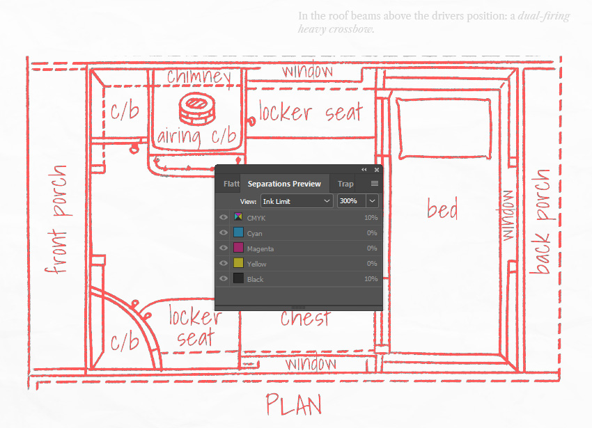
For this illustration, I accidentally used rich black instead of K100 and Adobe Indesign highlighted the problem (Preflight > Separations Preview > Ink Limit). Note the text above the image, which is K100 and thus given a pass.
Resolution.
My first experience with large-scale printing (expo booths) left me flabbergasted. The printers asked for a 100 dpi resolution. Whatever happened to 300 dpi? Was this a scam of some sorts?
The truth is that the standard print resolution of 300 dpi is great for things we see up close, like books or brochures. Bigger products — billboards, booths, even the posters you see hanging at the movie theater — don’t need to go that far.
Illustrator Tom Froese, who has created large-scale murals in Photoshop, has a handy guide to figuring out your resolution requirements here.
Dimensions.
Finally, we come to the Holy Grail of preflight: the size of your file.
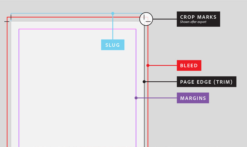
It is difficult to print exactly to the edge of a paper sheet. So what do you do when you have an image or a background fill that extends to the edges? To avoid unprinted edges, it is necessary to print a larger area than needed and then trim the paper down to its final size. Here’s a quick rundown of the relevant terms:
- Trim size is the final size of the image, after the extra bits have been cut off.
- The bleed is an extra image or color fill that extends beyond the trim area of your printing piece, and is cut off after printing. Typical bleed sizes are 5 mm in Europe and ⅛ of an inch in the US, but you should always ask your printer for specifications.
- The slug is the area beyond the bleed. It doesn’t get printed and typically contains instructions.
- The safety margin is the margin of error for printing: the area within the trim size that’s close to the edge and may accidentally get cut off. It’s not advised to put anything important (like text) in the safety margin.
And, because a picture is worth a thousand words, here’s the file structure in image form (courtesy of the Adobe Help center):
And that’s it, folks! We hope that this guide will help you come into your first printing experience prepared.