Movies are a visual medium, and their marketing rarely puts much emphasis on words. For shame! After all, a picture may paint a thousand words, but a picture of words speaks volumes.
The posters that do put their letters front and centre often look clean and original. So how do you create a type-heavy design? Let’s take a look at some popular solutions.
The Big Book Look
It’s all about hierarchy: a small emblematic image is combined with a large eye-catching title. Pioneered by design legend Paul Rand, this template was initially used in book covers to emphasize the names of “big” authors.
In film, this approach works best for recognizable properties like Sex and the City or James Bond. However, thanks to its dramatic heft, it’s a popular choice for festival films as well.
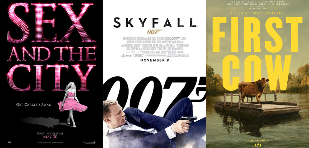
(L–R: The Ant Farm; unknown; BLT Communications, LLC)
Text over face
This once-ubiquitous fad started with the marketing campaign for David Fincher’s The Social Network. The film was a nuanced character study, and its poster reflected that. The precise framing of the eyes, the font variations, the barely-there search bar on the right — all of this made for a clever, iconic design. The devil’s in the details, and many designs that followed didn’t do detail well.
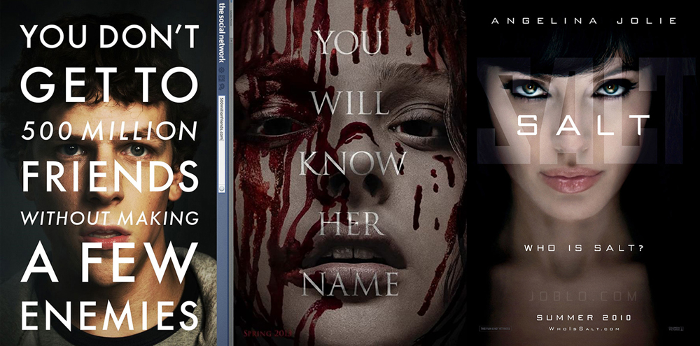
(L–R: Kellerhouse, Inc. feat. photography by Frank Ockenfels; ARSONAL feat. photography by Jill Greenberg; Ignition and LA)
Still, it’s a striking look even when kept simple. For a while, blocky text slapped over serious A-lister faces was the hottest thing in town. Unfortunately, the serious faces often belonged to actor Matt Damon, which made people take notice and start joking about an otherwise solid stylistic choice. A hundred humorous articles ensured that the fad became dead…for now.
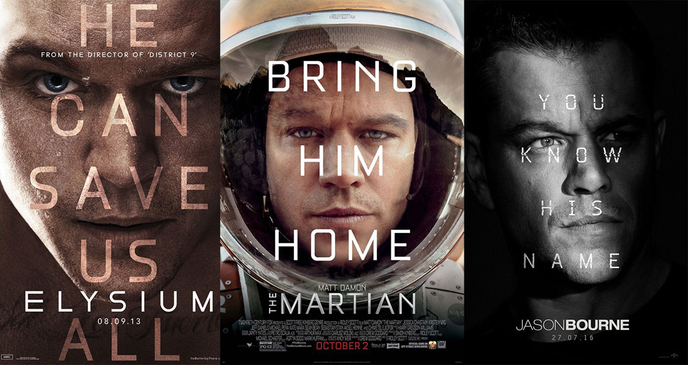
(l–R: cold open; Ignition feat. photography by Kurt Iswarienko; Concept Arts feat. photography by Frank Ockenfels)
Images in text
Let’s reverse things: instead of putting text over photos, you put photos into text. The title becomes a window into a landscape or a scene (or multiple landscapes and scenes if needed). This design is extremely versatile, high-contrast and readable, and is currently en vogue for both book covers and posters.
(L–R: Concept Arts; P+A; Ignition & LA)
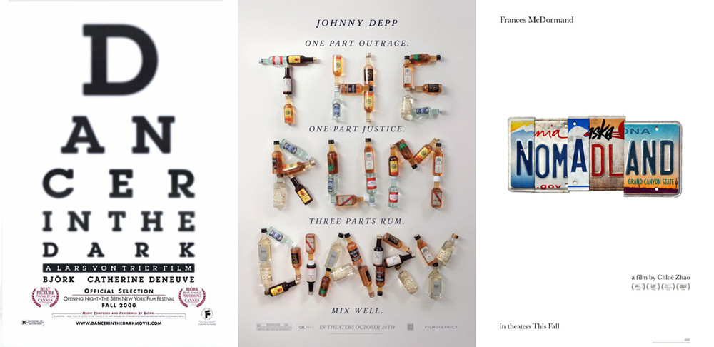
“Typography 101”.
This is Chip Kidd’s term for a common design exercise: lettering a word in a way that reflects its meaning, like mossy letters for the word “moss”. Kidd himself is not a fan; you either draw an apple or write “apple” — not both! However, this approach can be classy and subtle in the right hands.
(L–R: POV; The Refinery feat. photography by Ricardo Marenco; unknown)
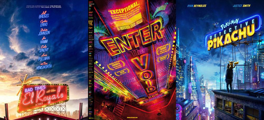
Integration into environments
Typography and imagery don’t have to lead parallel lives: you can incorporate type into landscapes via signage. Neon especially is great at creating atmosphere — a perfect fit for marketing campaigns that emphasize mood and setting over characters.
(L–R: LA; unknown; Art Machine)
Handwritten
This last trend is in line with the recent popularity of tactile, “human” design. Look at the “New in Fiction” section of your local bookstore, and you’ll see a selection of messy, handwritten titles. Film posters have yet to catch up to the trend, but some (mostly thrillers) are leading the way. Curiously, the style is normally used for the tagline rather than the title.
(L–R: Iconisus L&Y – Visual Communication Systems; Concept Arts; BLT Communications)