Over 340 posters were submitted to our Creative Brief for Sony Pictures Home Entertainment’s Blade Runner 2049 (view them all here). We took a moment to chat to the 2 artists Lon Chan and Tom Coupland who Sony selected as their winner and runner up.
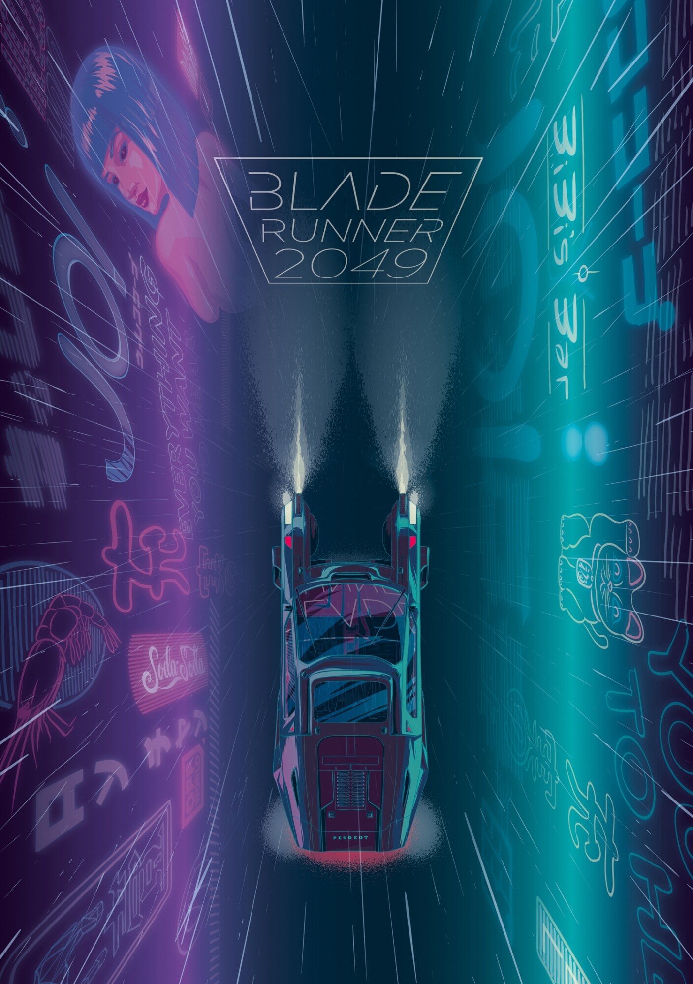
The overall winner, UK based artist Lon Chan was awarded £1000 and some Blade Runner 2049 goodies for is his efforts, his poster which is both beautiful and immersive, impressed us all. The poster is a motion poster and our brief for Blade Runner 2049 was the first brief to ever allow motion poster submissions. We love the perspective and colours used. You can see it below:
[su_vimeo url=”https://vimeo.com/254946694″ width=”1600″]
We asked Lon a few questions about his piece in the hopes to learn more about his creative process and what inspired him to create a motion poster for Blade Runner 2049.
You submitted a motion poster to the brief, what inspired you to create this animation?
I recently watched the Netflix series Abstract the first episode is all about the illustration work of Cristoph Niemann. His work for some of the New Yorker issues have been animated and I loved the cyclical nature of the animations and so have been wanting to create something with one of my future illustrations. Blade Runner 2049, seemed like the perfect time to try this out – the setting of the film lends itself perfectly to a more immersive artwork.
What software did you use to complete the piece? Did you learn anything new or struggle with any aspects?
I always start out with really rough physical sketches to work out concepts and compositions, then I go into photoshop to lay everything out and make sure it works in at the right scale and rough out a colour scheme. Normally my final stage is to draw everything in illustrator – I use a Wacom Cintiq which allows me to draw everything on screen and it’s a tool I couldn’t do without. For this poster it was a little different though because I knew that I was going to try and animate it. So I brought each asset into photoshop separately – I actually created the neon lights and adverts straight on in full as separate panels. In the end my biggest issue was my machine slowing down to a halt whilst rendering the frames, which was incredibly frustrating and time consuming every time something didn’t look right!
You piece focuses on the lights and atmosphere of BR2049, what inspired you to focus on this rather than the films characters?
I nearly always illustrate people in my posters, and it was something that I wanted to do differently with this one – I was aware that it would be really nice to illustrate all the interesting and striking characters, but the over arching feeling that the film left me with was the incredible atmosphere that the sound and visual environment created. Flying through the skyscrapers, rain lashing down whilst brilliant images of everything you could ever want flash and dance around you, all to the deep industrial thumping of some futuristic propulsion unit.
It’s a really interesting perspective, seeing the car from above with the lights and rain falling into the depths of the city below. Did you create other concepts?
As I said before I did consider doing one of the main characters, but I was worried it may be hard to make mine stand out as there would probably be so many great entries with this theme. I really wanted to concentrate on the futuristic setting and vehicles, so I looked at a few different angles but really loved the rain directing your eyes downward to the spinner. I was very aware that it had to work as both a poster and an animation and I wanted any animation to be loopable, just a little movement that keeps the eye moving around the piece.
Originally it was going to be the spinner flying forward through the corridor of buildings, whilst the holographic adverts moved past and around it, but trying to get the rain to follow the perspective whilst falling was too much for my little brain and my animation skills to deal with, not to mention my computer! So in the end I kept it simpler and had it floating in front of the blade runner 2049 title with the rain falling and the holograms flicking in and out.
What inspired you to take part in this creative brief?
I loved the the original Blade Runners visual aesthetic and BR2049 didn’t disappoint, so I was keen to draw the spinner straight away!
If I can fit it in, I always try to create something for PosterSpy briefs – the community is really great, and so encouraging. There isn’t any other place that I know of briefing project after project in association with top movie and TV studios, directors and actors who directly take a real interest in what the community create. It’s fun to create for your favourite movies, but there is also that buzz of doing something as a group and seeing all the different takes on a theme, and of course all the hype surrounding new releases.
Your piece was chosen from 350 other submissions, how does that feel?
To be honest I really still can’t totally believe it, I felt sure that it would go to one of the posters that had the characters front and centre. Tom’s piece is immense and I love his style, and there were so many other great entries – Adam Cockerton, Isabella Grace, Zi Xu, Ciarán O Donovan, Ben Farr, Ben Turner, Dustin Clarke, Mat Guillen, Michael Friebe, Jason Pooley, David Buisan, Heathbot, Frybnik to name a few (sorry to those I missed) so to win really is amazing. I’d like to thank Jack and anyone involved in shortlisting it and Sony Pictures for making the final decision – I guess it goes to show that going leftfield can lead you down a direction that sets you apart from the rest so if you’ve got an idea you believe in and style you’re confident with go with it!
What will you spend your winnings on? ;)
Ha ha to be honest our car died about six months ago, and so we had to get a replacement – it will go a long way to paying that off! Oh and a meal out with my very supportive wife, maybe a little Lego model for the kids and if there’s any left it’ll go into the bike fund!
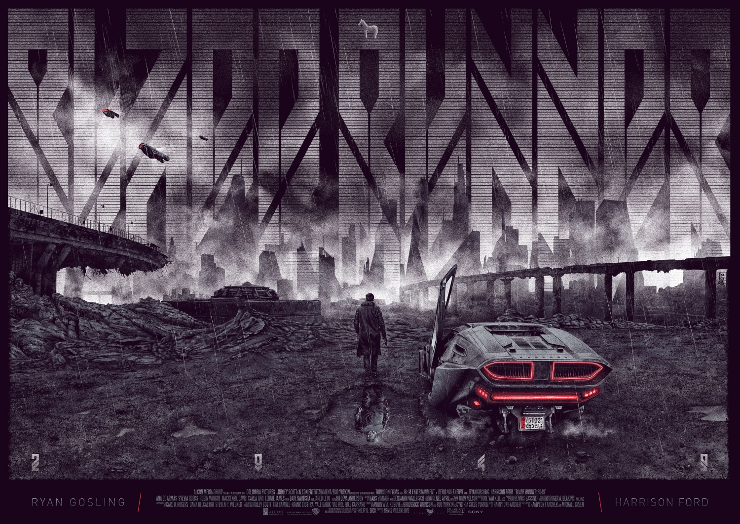
We also took a moment to chat to runner up Tom Coupland, who’s piece was very different to Lon’s but also incredibly stunning. We were very impressed by Tom’s attention to detail and atmosphere presented in his piece. Tom was awarded £500 and some Blade Runner 2049 goodies courtesy of Sony.
What made you choose this image and composition for your piece?
2049 is just visually stunning with so many ‘poster moments’. It actually took an awful lot of restraint not to try and squeeze them all into one poster, because believe me, I really wanted to. In the end my decision centred around a few factors:- This scene was one that really stuck with me personally. I quite like working with landscapes. I really wanted to include K’s Spinner because, obvious reasons and I kind of had this half baked idea with the title treatment in the background so the cityscape lent itself to that quite well (I thought).
Your entry uses a custom type, why did you decide to do that instead of using the films title treatment?
So like i mentioned, I had this vague idea about the title being part of the back drop and basically the official title treatment just wasn’t working with the space (if there’s one thing you learn early on, it’s that you never….e v e r stretch out or f*ck about with logo dimensions!) Also, I try to remind myself of the “alternative” in alternative movie poster so you can embrace the freedom, if it works. Anyway the idea grew so i went looking for something angular & sharp to sit in and almost replicate the futuristic skyline, then played with it a bit until i was happy.
Did you learn anything about yourself as an artist when making this piece.
Firstly, it still sits weird with me when i’m referred to as an “artist”, it just feels too professional, too serious, like I know exactly what i’m doing & i have my shit well & truly together. I don’t. Anyway, yeah…every time, with every piece. Things always crop up that present you with a new challenge, in this case, ripples in the puddles took me a little bit of time to get to a point where i thought it was ok, for now. I mean, that’s it with these things, there will be a time when i have to do something similar & i’ll look back at this and be like “really? that was the best you could do?!” Besides, then you zoom out & think, ffs people might not even notice them anyway, guess i just get unnecessarily lost in the detail sometimes ¯\_(ツ)_/¯
What will you do with your winnings ;)
None of your damn business.
Ha, well i was fortunate with the Three Billboards brief too, so i spent some of that on a poster…obviously. The Shape of Water by James Jean. Took a while but it arrived last week and it’s frickin’ stunning! So maybe something similar this time, for years my no.1 ISO has been Stout’s Total Recall, it’s slipped through my fingers numerous times so i’d love to finally snag that. Also, have you seen Chris Skinner’s BR2049?!….holy shit!
What inspired you to take part in this particular brief?
If i have the capacity then I try and enter as many as I can. This was a weird one really, basically i was juggling a few concept ideas without much success until i was struck down with tonsillitis and was totally FUBAR. I’d pretty much written this one off. Then with just over a week to go, I binned everything i had so far and started on this concept. So despite all the stuff i’ve rambled on about above, most of my decisions were heavily based on the impending deadline. Originally the idea was to have K’s shadow in the shape of the wooden horse (yep, similar thing i did for Preacher) which i thought looked pretty good. Then i read this piece on 2049 & how ‘reflections’ both physically & mentally, play a large part in the movie. This opened up a way for me to fit Deckard into the piece too and of course…rain! Is it even a BR piece without rain?! So after that started to work, i knew i had to get it finished. Props to Jack, the ever growing PS crew & cheers for all the kind words folks.
